比较不同库的测量结果#
我们现在比较napari-skimage-regionprops的regionprops_table和napari-simpleitk-image-processing的label_statistics中perimeter测量的实现。
import numpy as np
import pandas as pd
from skimage.io import imread
from pyclesperanto_prototype import imshow
from skimage import filters
from skimage import measure
import matplotlib.pyplot as plt
from napari_skimage_regionprops import regionprops_table
from skimage import filters
from napari_simpleitk_image_processing import label_statistics
C:\Users\maral\mambaforge\envs\feature_blogpost\lib\site-packages\morphometrics\measure\label.py:7: TqdmExperimentalWarning: Using `tqdm.autonotebook.tqdm` in notebook mode. Use `tqdm.tqdm` instead to force console mode (e.g. in jupyter console)
  from tqdm.autonotebook import tqdm
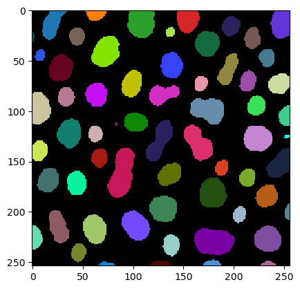
为此,我们需要一个图像和一个标签图像。
# load image
image = imread("../../data/blobs.tif")

# denoising
blurred_image = filters.gaussian(image, sigma=1)

# binarization
threshold = filters.threshold_otsu(blurred_image)
thresholded_image = blurred_image >= threshold

# labeling
label_image = measure.label(thresholded_image)

# visualization
imshow(label_image, labels=True)
我们使用regionprops_table函数得到周长测量结果
skimage_statistics = regionprops_table(image, label_image, perimeter = True)
skimage_statistics
| label | area | bbox_area | equivalent_diameter | convex_area | max_intensity | mean_intensity | min_intensity | perimeter | perimeter_crofton | standard_deviation_intensity | |
|---|---|---|---|---|---|---|---|---|---|---|---|
| 0 | 1 | 429 | 750 | 23.371345 | 479 | 232.0 | 191.440559 | 128.0 | 89.012193 | 87.070368 | 29.793138 |
| 1 | 2 | 183 | 231 | 15.264430 | 190 | 224.0 | 179.846995 | 128.0 | 53.556349 | 53.456120 | 21.270534 |
| 2 | 3 | 658 | 756 | 28.944630 | 673 | 248.0 | 205.604863 | 120.0 | 95.698485 | 93.409370 | 29.392255 |
| 3 | 4 | 433 | 529 | 23.480049 | 445 | 248.0 | 217.515012 | 120.0 | 77.455844 | 76.114262 | 35.852345 |
| 4 | 5 | 472 | 551 | 24.514670 | 486 | 248.0 | 213.033898 | 128.0 | 83.798990 | 82.127941 | 28.741080 |
| ... | ... | ... | ... | ... | ... | ... | ... | ... | ... | ... | ... |
| 57 | 58 | 213 | 285 | 16.468152 | 221 | 224.0 | 184.525822 | 120.0 | 52.284271 | 52.250114 | 28.255467 |
| 58 | 59 | 79 | 108 | 10.029253 | 84 | 248.0 | 184.810127 | 128.0 | 39.313708 | 39.953250 | 33.739912 |
| 59 | 60 | 88 | 110 | 10.585135 | 92 | 216.0 | 182.727273 | 128.0 | 45.692388 | 46.196967 | 24.417173 |
| 60 | 61 | 52 | 75 | 8.136858 | 56 | 248.0 | 189.538462 | 128.0 | 30.692388 | 32.924135 | 37.867411 |
| 61 | 62 | 48 | 68 | 7.817640 | 53 | 224.0 | 173.833333 | 128.0 | 33.071068 | 35.375614 | 27.987596 |
62 rows × 11 columns
… 并使用label_statistics函数
simpleitk_statistics = label_statistics(image, label_image, size = False, intensity = False, perimeter = True)
simpleitk_statistics
| label | perimeter | perimeter_on_border | perimeter_on_border_ratio | |
|---|---|---|---|---|
| 0 | 1 | 87.070368 | 16.0 | 0.183759 |
| 1 | 2 | 53.456120 | 21.0 | 0.392846 |
| 2 | 3 | 93.409370 | 23.0 | 0.246228 |
| 3 | 4 | 76.114262 | 20.0 | 0.262763 |
| 4 | 5 | 82.127941 | 40.0 | 0.487045 |
| ... | ... | ... | ... | ... |
| 57 | 58 | 52.250114 | 0.0 | 0.000000 |
| 58 | 59 | 39.953250 | 18.0 | 0.450527 |
| 59 | 60 | 46.196967 | 22.0 | 0.476222 |
| 60 | 61 | 32.924135 | 15.0 | 0.455593 |
| 61 | 62 | 35.375614 | 17.0 | 0.480557 |
62 rows × 4 columns
对于这个比较,我们只对名为perimeter的列感兴趣。因此,我们选择这一列并将其中的测量结果转换为numpy数组:
skimage_perimeter = np.asarray(skimage_statistics['perimeter'])
simpleitk_perimeter = np.asarray(simpleitk_statistics['perimeter'])
散点图#
如果我们现在使用matplotlib将这两种周长测量结果相互绘制,我们得到以下散点图:
plt.plot(skimage_perimeter, simpleitk_perimeter, 'o')
[<matplotlib.lines.Line2D at 0x1912b551220>]
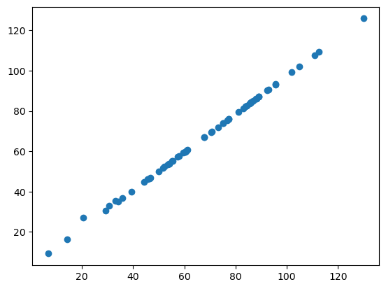
如果这两个库以相同的方式计算周长,我们所有的数据点都应该位于一条直线上。正如你所看到的,它们并不是。这表明周长在napari-skimage-regionprops和napari-simpleitk-image-processing中的实现方式不同。
Bland-Altman图#
Bland-Altman图有助于可视化测量之间的差异。我们可以为我们的两种不同的perimeter实现计算Bland-Altman图,如下所示:
# compute mean, diff, md and sd
mean = (skimage_perimeter + simpleitk_perimeter) / 2
diff = skimage_perimeter - simpleitk_perimeter
md = np.mean(diff) # mean of difference
sd = np.std(diff, axis = 0) # standard deviation of difference

# add mean and diff
plt.plot(mean, diff, 'o')

# add lines
plt.axhline(md,           color='gray', linestyle='--')
plt.axhline(md + 1.96*sd, color='gray', linestyle='--')
plt.axhline(md - 1.96*sd, color='gray', linestyle='--')

# add title and axes labels
plt.title('Bland-Altman Plot')
plt.xlabel('Average Measurement')
plt.ylabel('Difference of Measurement')
Text(0, 0.5, 'Difference of Measurement')
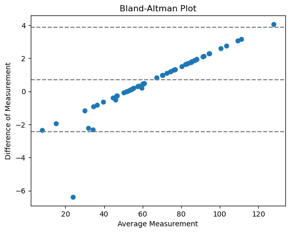
其中
中心线 = 两种方法之间的平均差异
两条外线 = 一致性的置信区间(CI)
点不朝向0,这意味着这不是一个具有随机相对误差的一致性,而是系统性的。这是很有道理的,因为我们在这里比较的是测量的__实现__。
练习#
使用regionprops_table和label_statistics函数来测量你的标签图像的feret_diameter_max。绘制散点图和Bland-Altman图。你认为这两个库中feret_diameter_max的实现是否不同?