Trazado de gráficos con Matplotlib#
Una biblioteca sencilla y directa para trazar datos es matplotlib.
Ver también:
import math
import matplotlib.pyplot as plt
Para trazar, necesitamos valores para graficar. Comencemos con una lista de valores x:
x_values = range(0, 360, 10)
Para calcular los valores y correspondientes, usamos un bucle for que crea una nueva lista de valores igual a la lista x_values y calcula un nuevo número para cada entrada:
y_values = [math.sin(x * math.pi / 180) for x in x_values]
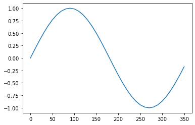
Luego, dibujemos un gráfico simple
plt.plot(x_values, y_values)
[<matplotlib.lines.Line2D at 0x12aa15610>]
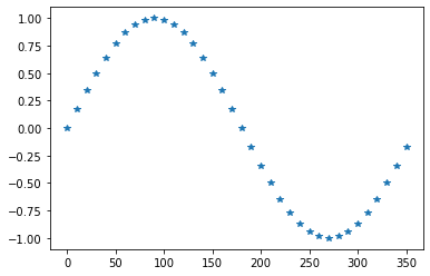
Los gráficos se pueden modificar de varias maneras.
plt.plot(x_values, y_values, '*')
[<matplotlib.lines.Line2D at 0x12ab6c3d0>]
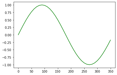
plt.plot(x_values, y_values, color='green')
[<matplotlib.lines.Line2D at 0x12abddc10>]
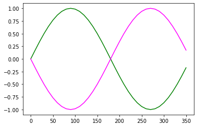
Si quieres combinar múltiples gráficos en una figura, puedes hacer esto:
plt.plot(x_values, y_values, color='green')

neg_y_values = [- y for y in y_values]
plt.plot(x_values, neg_y_values, color='magenta')
[<matplotlib.lines.Line2D at 0x12ac5d130>]
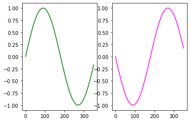
Subgráficos#
El comando subplots te permite tener múltiples gráficos en un bloque.
fig,axs = plt.subplots(1, 2)

axs[0].plot(x_values, y_values, color='green')
axs[1].plot(x_values, neg_y_values, color='magenta')
[<matplotlib.lines.Line2D at 0x12acffc10>]
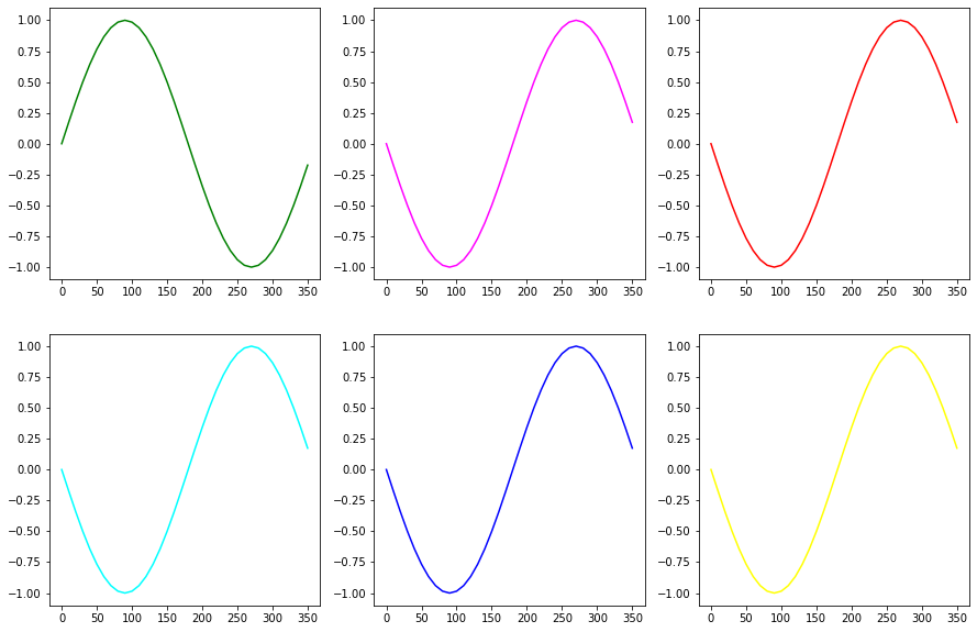
fig,axs = plt.subplots(2, 3, figsize=[15,10])

axs[0,0].plot(x_values, y_values, color='green')
axs[0,1].plot(x_values, neg_y_values, color='magenta')
axs[0,2].plot(x_values, neg_y_values, color='red')
axs[1,0].plot(x_values, neg_y_values, color='cyan')
axs[1,1].plot(x_values, neg_y_values, color='blue')
axs[1,2].plot(x_values, neg_y_values, color='yellow')
[<matplotlib.lines.Line2D at 0x12aec7190>]
Ejercicio#
Traza el seno y el coseno de valores entre 0 y 360 grados en un solo gráfico.