Comparación de mediciones de diferentes bibliotecas#
Ahora comparamos la implementación de la medición perimeter en napari-skimage-regionprops regionprops_table y napari-simpleitk-image-processing label_statistics.
import numpy as np
import pandas as pd
from skimage.io import imread
from pyclesperanto_prototype import imshow
from skimage import filters
from skimage import measure
import matplotlib.pyplot as plt
from napari_skimage_regionprops import regionprops_table
from skimage import filters
from napari_simpleitk_image_processing import label_statistics
C:\Users\maral\mambaforge\envs\feature_blogpost\lib\site-packages\morphometrics\measure\label.py:7: TqdmExperimentalWarning: Using `tqdm.autonotebook.tqdm` in notebook mode. Use `tqdm.tqdm` instead to force console mode (e.g. in jupyter console)
  from tqdm.autonotebook import tqdm
Por lo tanto, necesitamos una imagen y una imagen de etiquetas.
# load image
image = imread("../../data/blobs.tif")
# denoising
blurred_image = filters.gaussian(image, sigma=1)
# binarization
threshold = filters.threshold_otsu(blurred_image)
thresholded_image = blurred_image >= threshold
# labeling
label_image = measure.label(thresholded_image)
# visualization
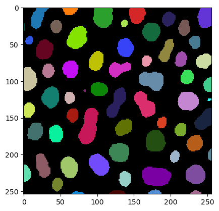
imshow(label_image, labels=True)
Obtenemos las mediciones del perímetro utilizando la función regionprops_table
skimage_statistics = regionprops_table(image, label_image, perimeter = True)
skimage_statistics
| label | area | bbox_area | equivalent_diameter | convex_area | max_intensity | mean_intensity | min_intensity | perimeter | perimeter_crofton | standard_deviation_intensity | |
|---|---|---|---|---|---|---|---|---|---|---|---|
| 0 | 1 | 429 | 750 | 23.371345 | 479 | 232.0 | 191.440559 | 128.0 | 89.012193 | 87.070368 | 29.793138 |
| 1 | 2 | 183 | 231 | 15.264430 | 190 | 224.0 | 179.846995 | 128.0 | 53.556349 | 53.456120 | 21.270534 |
| 2 | 3 | 658 | 756 | 28.944630 | 673 | 248.0 | 205.604863 | 120.0 | 95.698485 | 93.409370 | 29.392255 |
| 3 | 4 | 433 | 529 | 23.480049 | 445 | 248.0 | 217.515012 | 120.0 | 77.455844 | 76.114262 | 35.852345 |
| 4 | 5 | 472 | 551 | 24.514670 | 486 | 248.0 | 213.033898 | 128.0 | 83.798990 | 82.127941 | 28.741080 |
| ... | ... | ... | ... | ... | ... | ... | ... | ... | ... | ... | ... |
| 57 | 58 | 213 | 285 | 16.468152 | 221 | 224.0 | 184.525822 | 120.0 | 52.284271 | 52.250114 | 28.255467 |
| 58 | 59 | 79 | 108 | 10.029253 | 84 | 248.0 | 184.810127 | 128.0 | 39.313708 | 39.953250 | 33.739912 |
| 59 | 60 | 88 | 110 | 10.585135 | 92 | 216.0 | 182.727273 | 128.0 | 45.692388 | 46.196967 | 24.417173 |
| 60 | 61 | 52 | 75 | 8.136858 | 56 | 248.0 | 189.538462 | 128.0 | 30.692388 | 32.924135 | 37.867411 |
| 61 | 62 | 48 | 68 | 7.817640 | 53 | 224.0 | 173.833333 | 128.0 | 33.071068 | 35.375614 | 27.987596 |
62 rows × 11 columns
… y usando la función label_statistics
simpleitk_statistics = label_statistics(image, label_image, size = False, intensity = False, perimeter = True)
simpleitk_statistics
| label | perimeter | perimeter_on_border | perimeter_on_border_ratio | |
|---|---|---|---|---|
| 0 | 1 | 87.070368 | 16.0 | 0.183759 |
| 1 | 2 | 53.456120 | 21.0 | 0.392846 |
| 2 | 3 | 93.409370 | 23.0 | 0.246228 |
| 3 | 4 | 76.114262 | 20.0 | 0.262763 |
| 4 | 5 | 82.127941 | 40.0 | 0.487045 |
| ... | ... | ... | ... | ... |
| 57 | 58 | 52.250114 | 0.0 | 0.000000 |
| 58 | 59 | 39.953250 | 18.0 | 0.450527 |
| 59 | 60 | 46.196967 | 22.0 | 0.476222 |
| 60 | 61 | 32.924135 | 15.0 | 0.455593 |
| 61 | 62 | 35.375614 | 17.0 | 0.480557 |
62 rows × 4 columns
Para esta comparación, solo nos interesa la columna llamada perimeter. Así que seleccionamos esta columna y convertimos las mediciones incluidas en un numpy array:
skimage_perimeter = np.asarray(skimage_statistics['perimeter'])
simpleitk_perimeter = np.asarray(simpleitk_statistics['perimeter'])
Gráfico de dispersión#
Si ahora usamos matplotlib para graficar las dos mediciones de perímetro una contra la otra, obtenemos el siguiente gráfico de dispersión:
plt.plot(skimage_perimeter, simpleitk_perimeter, 'o')
[<matplotlib.lines.Line2D at 0x1912b551220>]
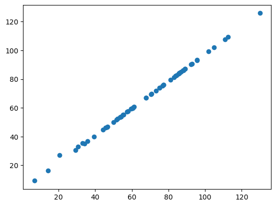
Si las dos bibliotecas calcularan el perímetro de la misma manera, todos nuestros puntos de datos estarían en una línea recta. Como puedes ver, no lo están. Esto sugiere que el perímetro está implementado de manera diferente en napari-skimage-regionprops y napari-simpleitk-image-processing.
Gráfico de Bland-Altman#
El gráfico de Bland-Altman ayuda a visualizar la diferencia entre mediciones. Podemos calcular un gráfico de Bland-Altman para nuestras dos implementaciones diferentes de perimeter de esta manera:
# compute mean, diff, md and sd
mean = (skimage_perimeter + simpleitk_perimeter) / 2
diff = skimage_perimeter - simpleitk_perimeter
md = np.mean(diff) # mean of difference
sd = np.std(diff, axis = 0) # standard deviation of difference

# add mean and diff
plt.plot(mean, diff, 'o')

# add lines
plt.axhline(md,           color='gray', linestyle='--')
plt.axhline(md + 1.96*sd, color='gray', linestyle='--')
plt.axhline(md - 1.96*sd, color='gray', linestyle='--')

# add title and axes labels
plt.title('Gráfico de Bland-Altman')
plt.xlabel('Medición Promedio')
plt.ylabel('Diferencia de Medición')
Text(0, 0.5, 'Difference of Measurement')
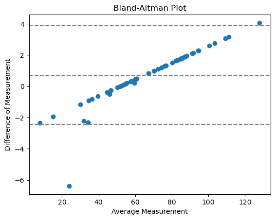
Con
línea central = diferencia media entre los métodos
dos líneas externas = intervalo de confianza de acuerdo (CI)
Los puntos no tienden a 0, lo que significa que no hay un acuerdo con error relativo aleatorio, sino sistemático. Esto tiene mucho sentido, porque aquí estamos comparando la implementación de una medición.
Ejercicio#
Utiliza las funciones regionprops_table y label_statistics para medir feret_diameter_max de tu imagen de etiquetas. Grafica el gráfico de dispersión y el gráfico de Bland-Altman. ¿Crees que feret_diameter_max está implementado de manera diferente en las dos bibliotecas?