Plotting with Seaborn#
In this notebook, we’ll explore how to create beautiful and informative plots using Seaborn, a statistical data visualization library built on top of Matplotlib. Seaborn provides a high-level interface for drawing attractive and informative statistical graphics.
First, let’s import the necessary libraries and set the style for our plots.
import numpy as np
import pandas as pd
import matplotlib.pyplot as plt
import seaborn as sns

# Set the style for our plots
sns.set_style("whitegrid")
Now, let’s create some sample data to work with. We’ll use Pandas to create a DataFrame with random data.
np.random.seed(0)
df = pd.DataFrame({
    'x': np.random.randn(100),
    'y': np.random.randn(100),
    'category': np.random.choice(['A', 'B', 'C'], 100)
})
df.head()
| x | y | category | |
|---|---|---|---|
| 0 | 1.764052 | 1.883151 | A |
| 1 | 0.400157 | -1.347759 | C |
| 2 | 0.978738 | -1.270485 | B |
| 3 | 2.240893 | 0.969397 | C |
| 4 | 1.867558 | -1.173123 | B |
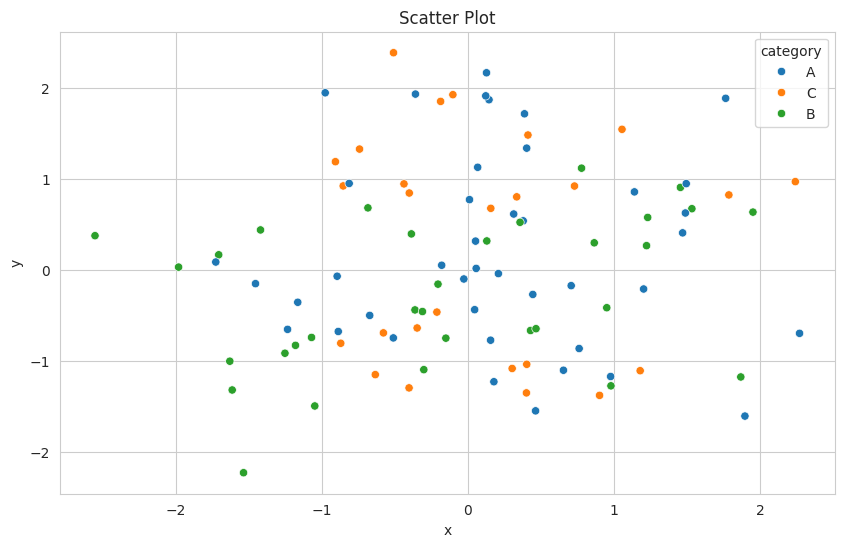
Let’s start with a simple scatter plot using Seaborn’s scatterplot function.
plt.figure(figsize=(10, 6))
sns.scatterplot(data=df, x='x', y='y', hue='category')
plt.title('Scatter Plot')
plt.show()
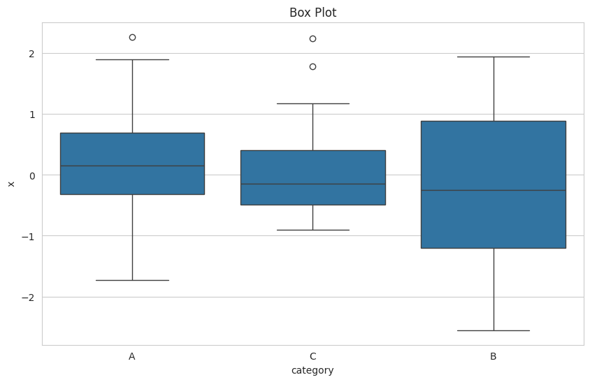
Next, let’s create a box plot to visualize the distribution of ‘x’ for each category.
plt.figure(figsize=(10, 6))
sns.boxplot(data=df, x='category', y='x')
plt.title('Box Plot')
plt.show()
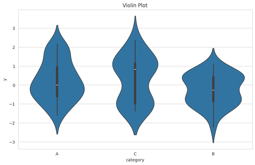
Now, let’s create a violin plot, which combines a box plot with a kernel density estimation.
plt.figure(figsize=(10, 6))
sns.violinplot(data=df, x='category', y='y')
plt.title('Violin Plot')
plt.show()
Let’s create a pair plot to visualize relationships between multiple variables at once.
sns.pairplot(df, hue='category')
plt.suptitle('Pair Plot', y=1.02)
plt.show()

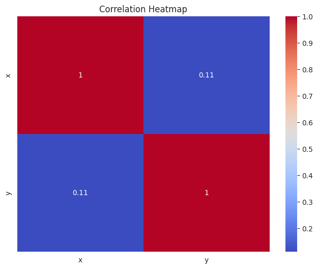
Finally, let’s create a heatmap to visualize the correlation between variables.
correlation = df[['x', 'y']].corr()
plt.figure(figsize=(8, 6))
sns.heatmap(correlation, annot=True, cmap='coolwarm')
plt.title('Correlation Heatmap')
plt.show()
This concludes our introduction to plotting with Seaborn. We’ve covered several types of plots, including scatter plots, box plots, violin plots, pair plots, and heatmaps. Seaborn offers many more plot types and customization options, which you can explore in the official documentation.